
Aperture Brand Identity
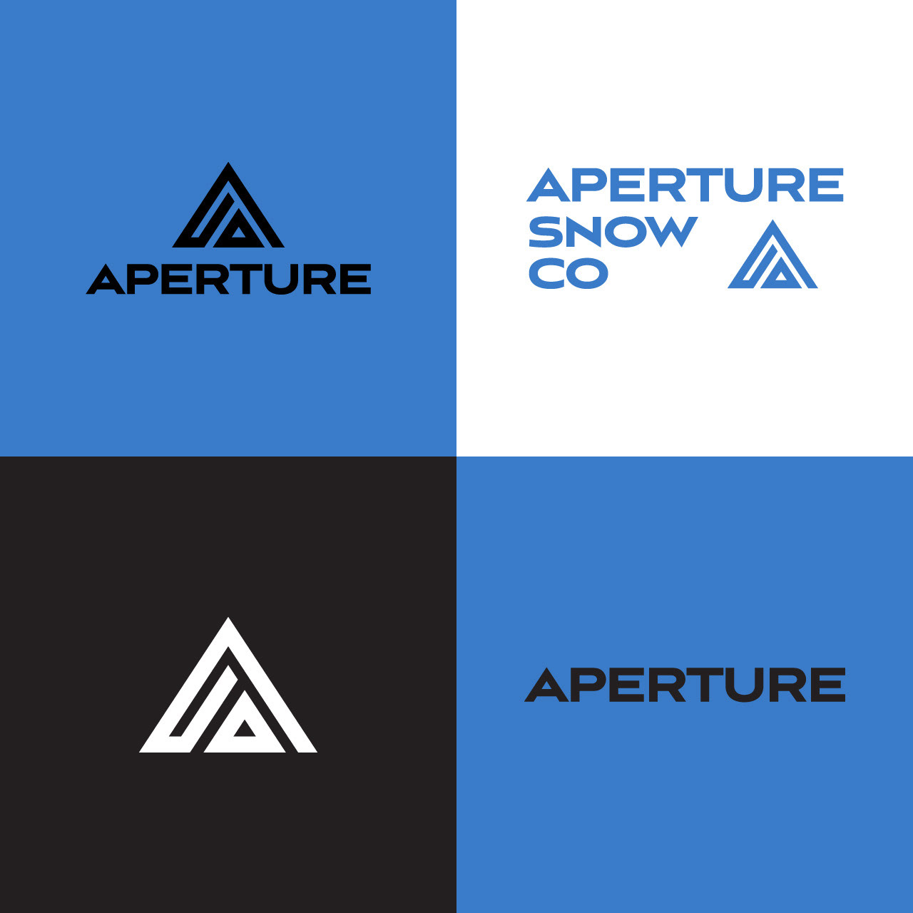
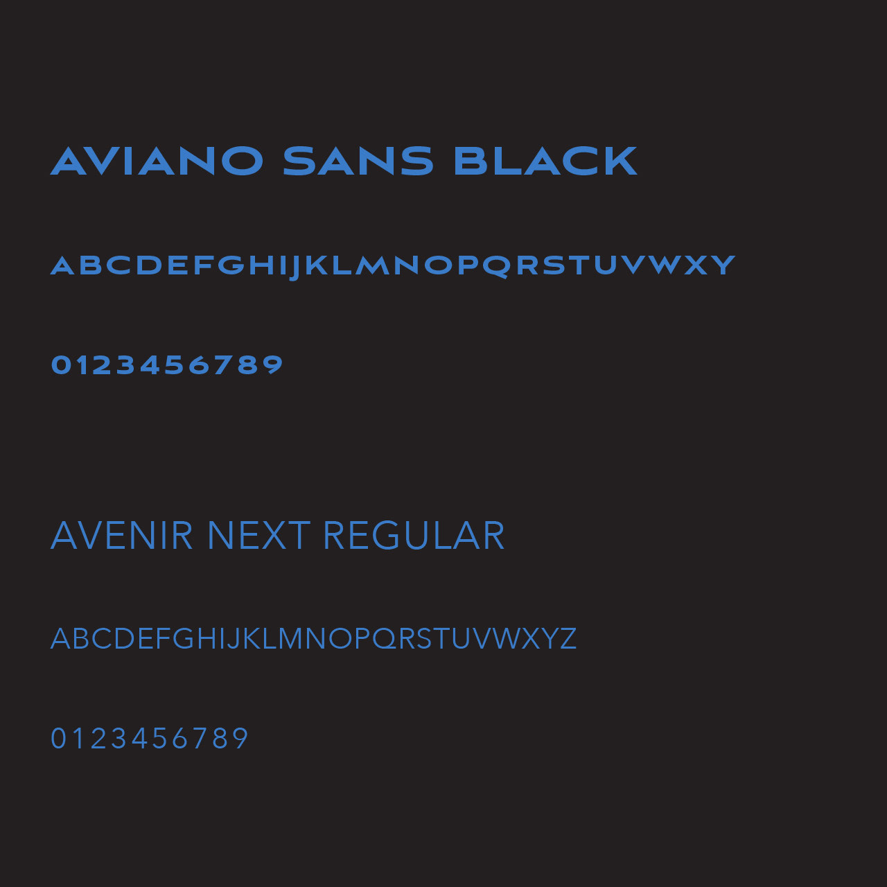
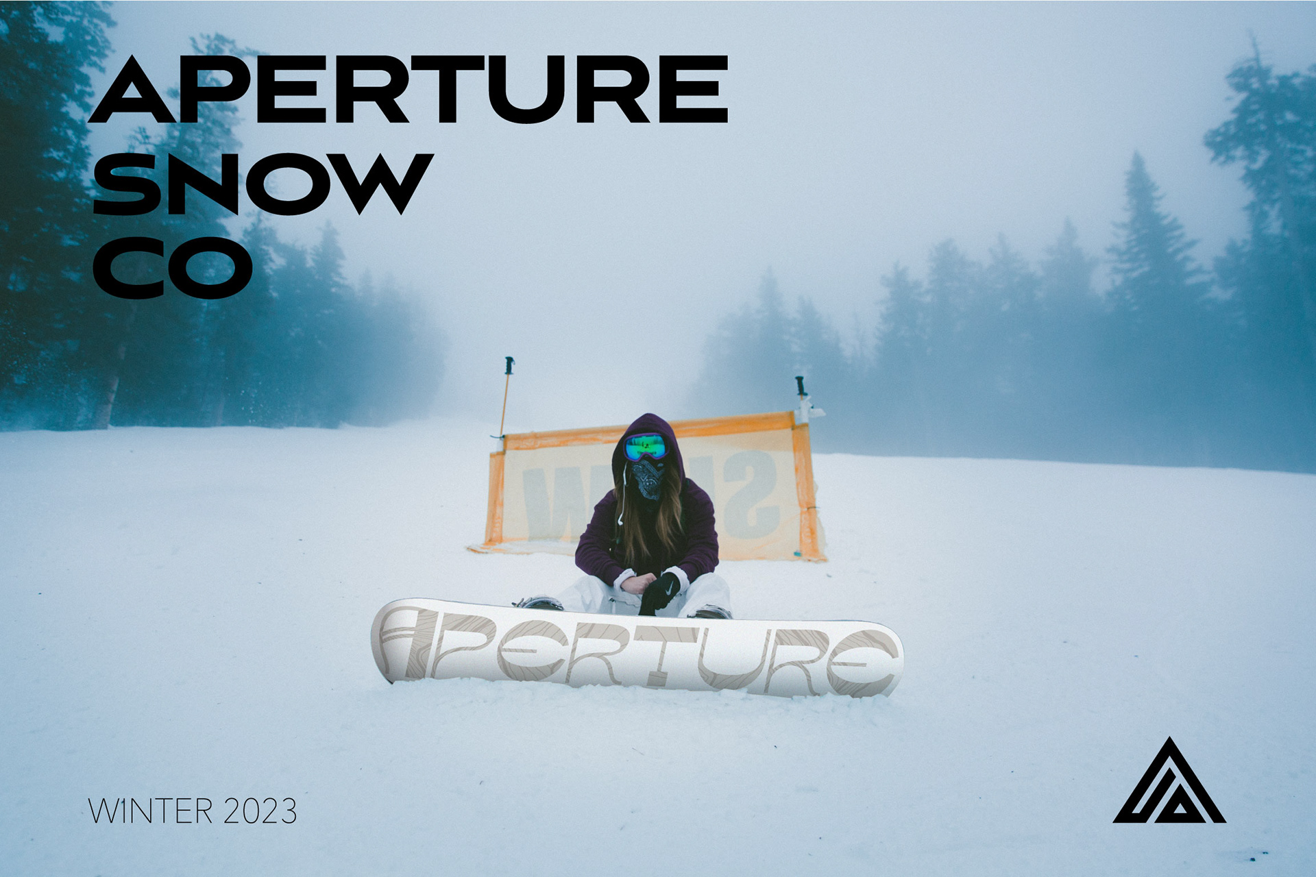
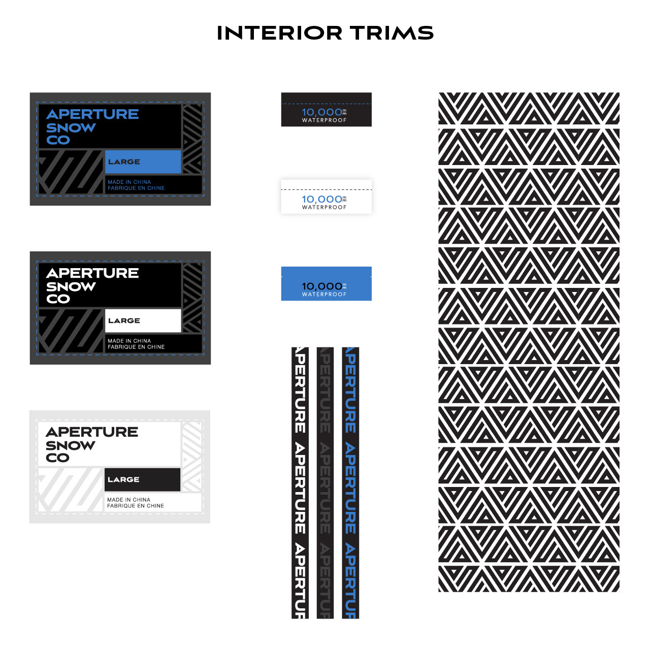
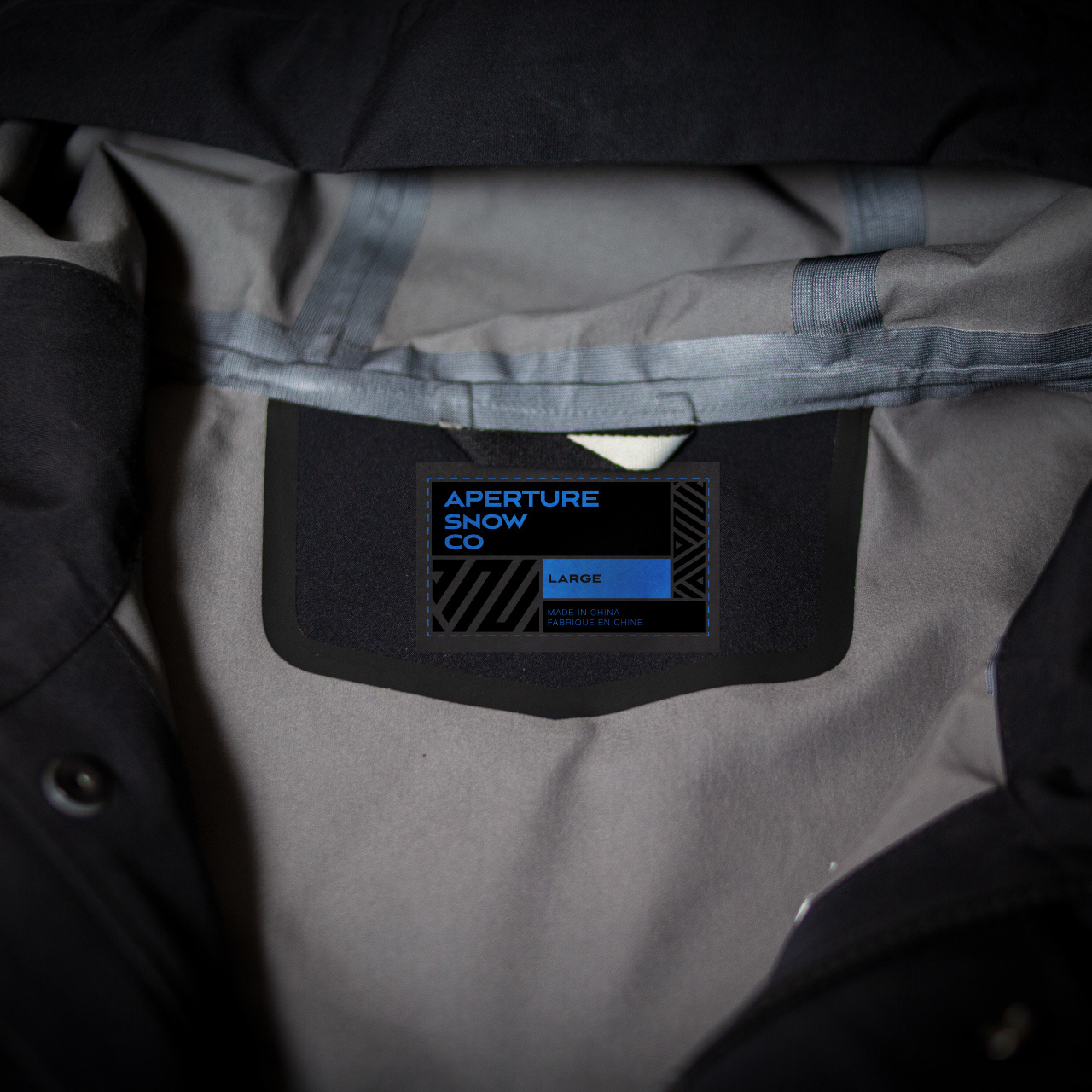
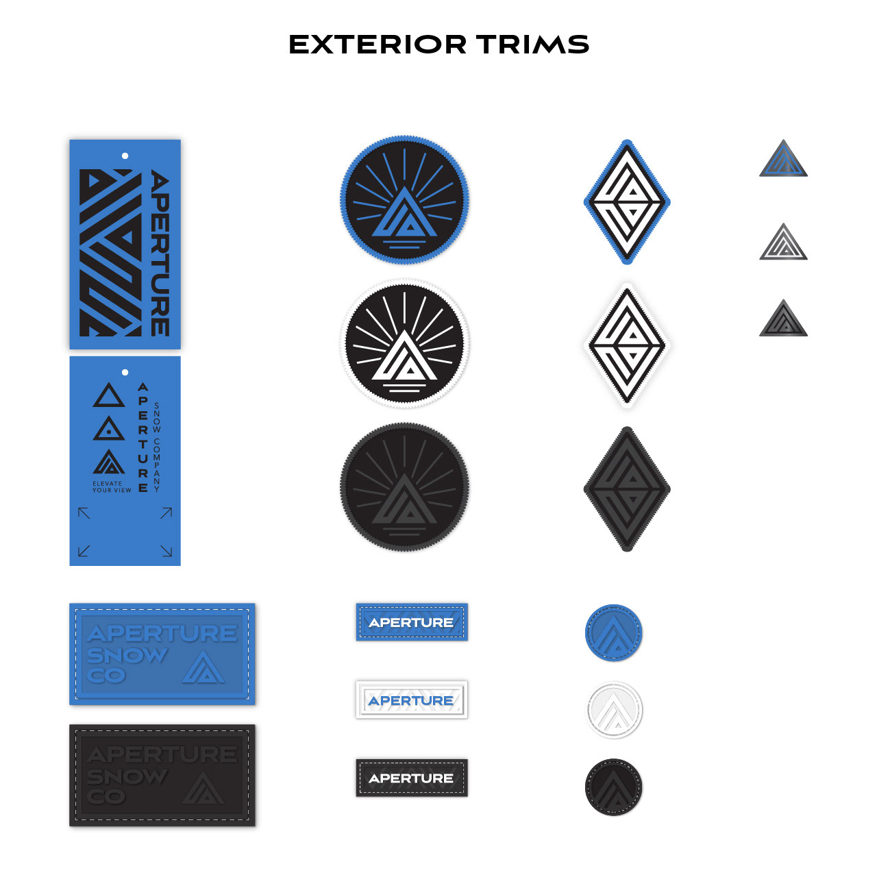
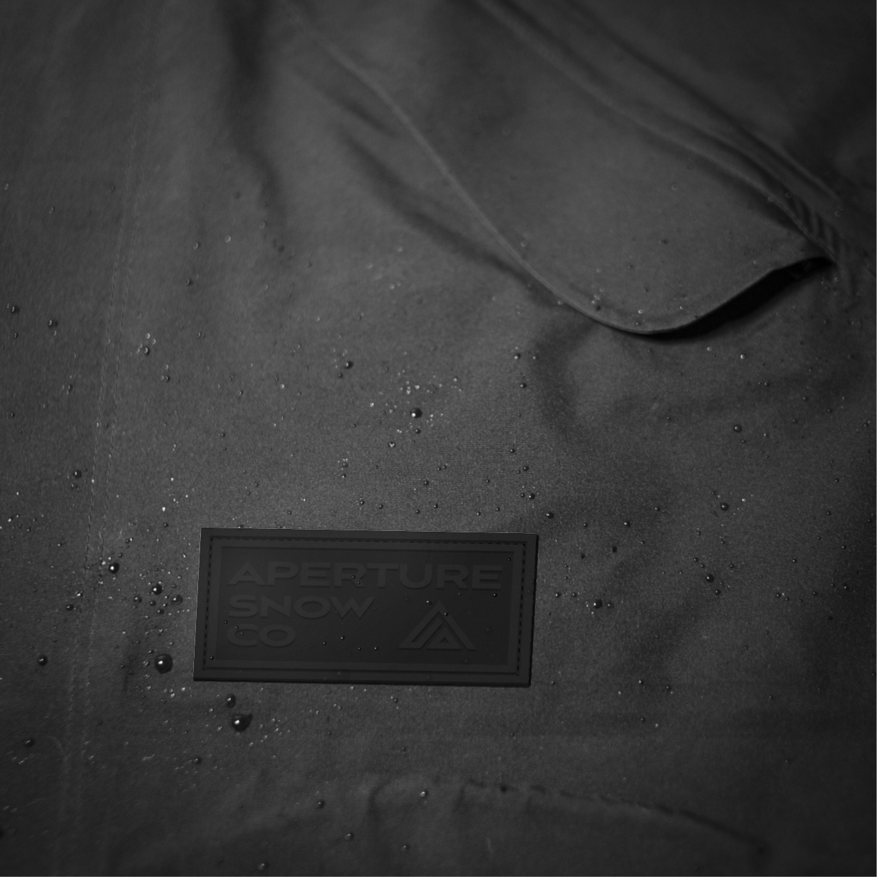
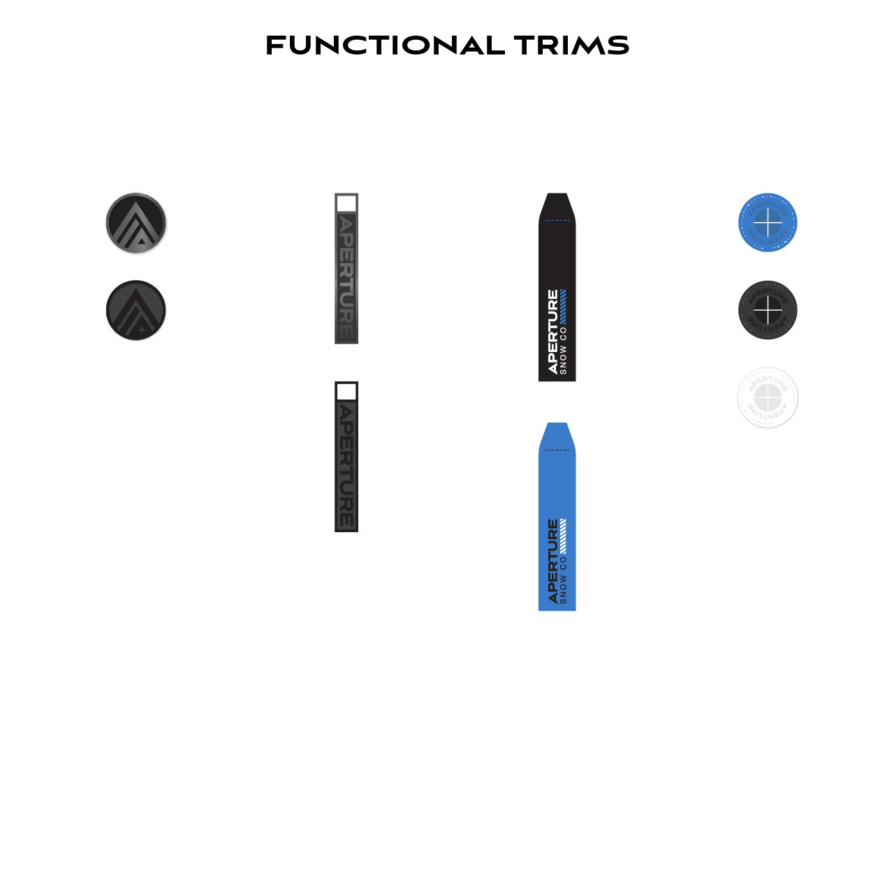
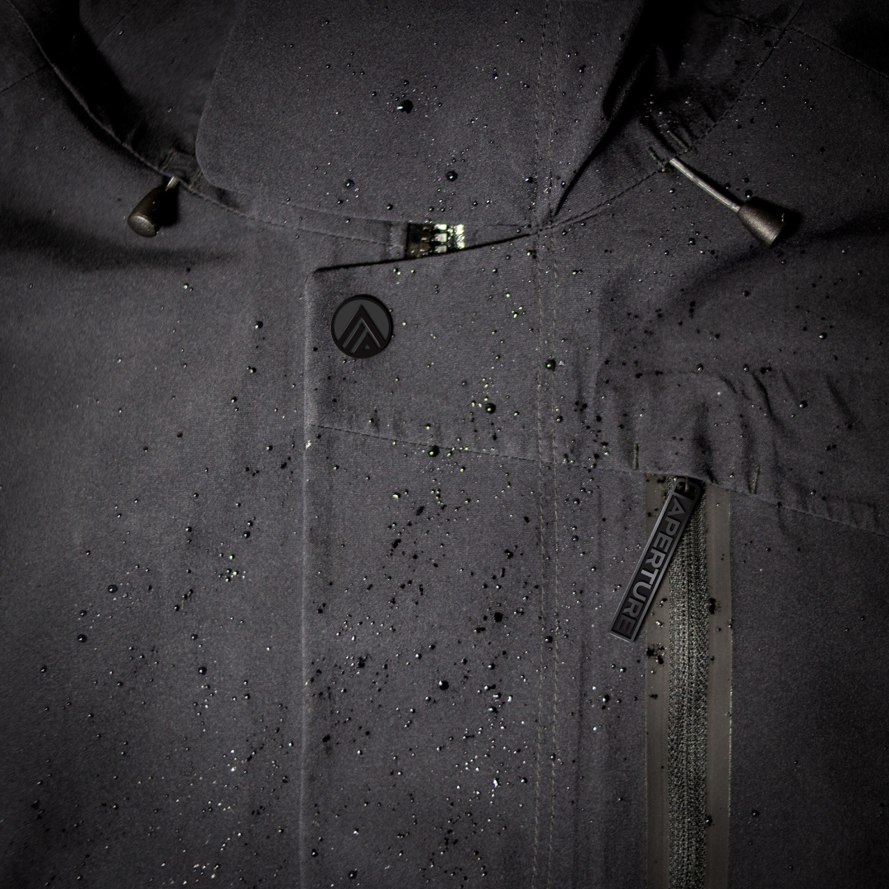
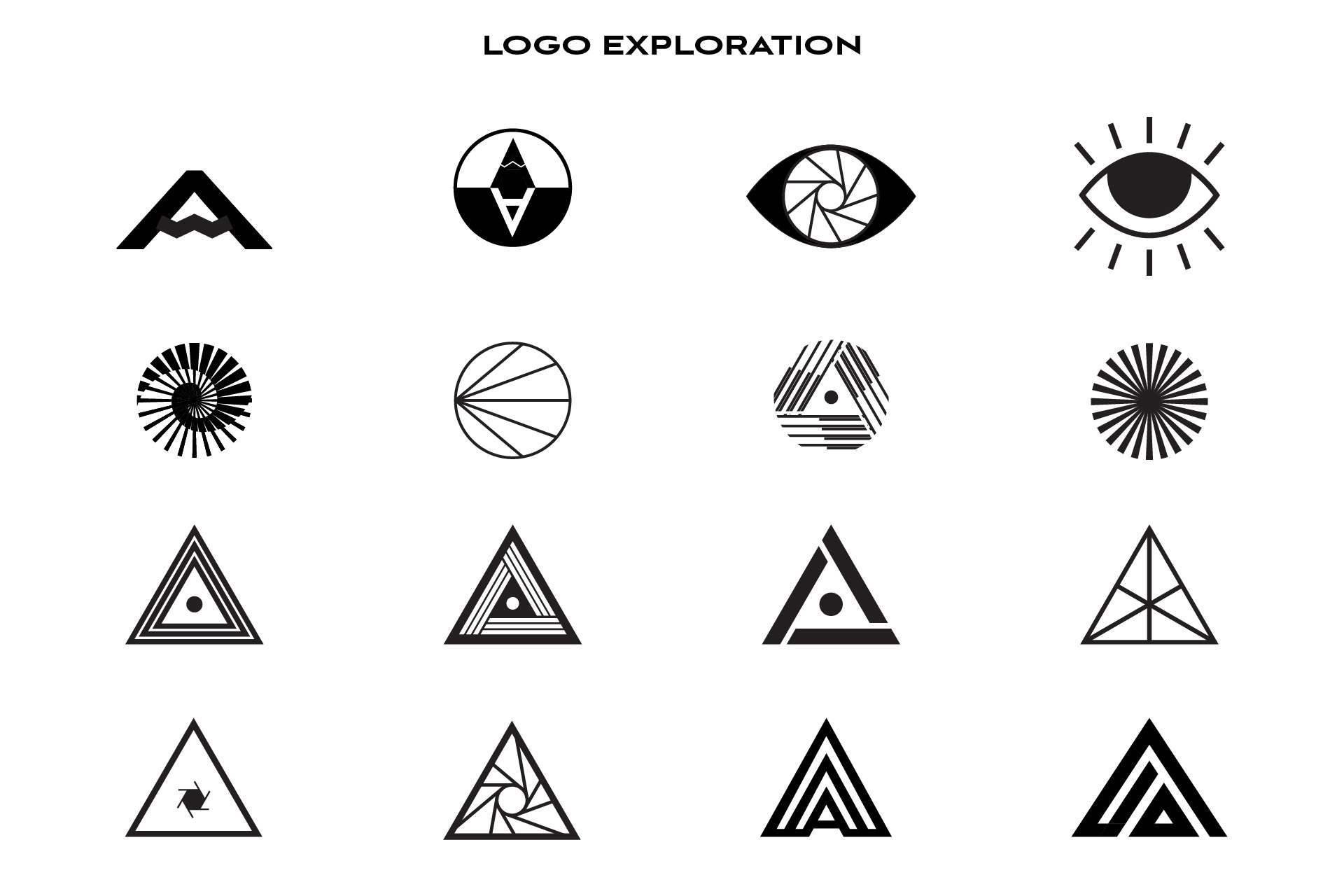
Aperture is a functional, entry level, private label snowboard and outerwear brand. Tasked with refreshing the branding and packaging, I developed a mountain inspired logo matched to a bold, geometric, sans serif font. The new brand packaging was built out with a technical inspired look using clean, typographic layouts, molded rubber labels, and fun patches.
A big challenge during this project was working remotely during Covid. I learned a lot about being adaptable and helped to develop new internal design processes using tools like Google Drive, Slides, and Docs to prepare and present direction and design concepts virtually. Many of these innovations proved to be valuable and are still in use now that work has returned to the office.


The logo discovery process explored forms based on the letter A, mountains, an elevation symbol, light, prisms and various apertures. Ultimately, the stakeholders decided on a bold, monoline, mountain inspired logo with a silhouette mirroring the A from the logotype.

Of course, I kicked off the project with mood boards exploring different visual identities for Aperture. I presented two directions. The first direction was a simple, modern, geometric look with a technical feel. The second added a little more character combining modern, geometric design with a touch of mysticism. Ultimately, we pursued the minimal, geometric look as the most neutral brand narrative able to adapt to seasonal trends.

